🪅Colour Choice & Strategy
Learn to use colour like a pro, whether you want to choose from the Sandbox Extended Palette or create a custom palette of your own and develop a unique art style for an Experience.
Light & Colour in The Sandbox
Reference: Colour in VoxEdit
↕️ Hue Selection
Hue is the colour base
↕️ Light
↔️ Saturation
Saturation is intensity
Lightness is:
⬆️tint (whiter)
⬇️shade (blacker)
Emissive Colour
(Toggle)
This button switches the colour into a mode that creates the illusion of casting a glowing light from the asset when used in an Experience. Tip: To make an asset shine light on other assets placed in an Experience, use Light behaviour.
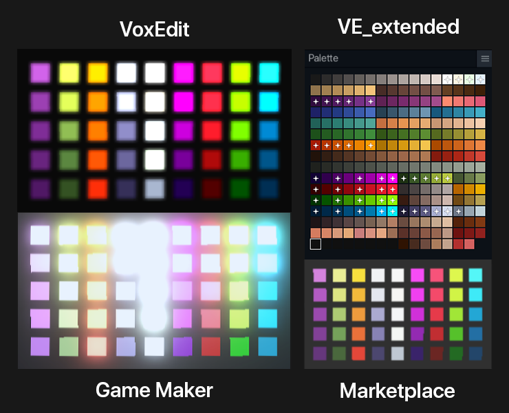
Emissive Colour Differences
QUALITY ASSURANCE
Colour and emissive glow may appear different between VoxEdit, the Marketplace, and in the game world of Game Maker and the Game Client. Test assets thoroughly for game world quality. The graphic below will be updated soon to reflect recent updates to the ecosystem.
Below is a helpful comparison of how some colours and emissive glow will appear in different software of The Sandbox ecosystem.

New Light Behaviour
Light behaviour can be used to make the emissive colours of an asset seem to shine their light onto other nearby objects to make a scene feel more natural since assets do not emit light onto other surfaces.
Example:
The image on the right shows how light in an Experience changes the apparent color of the asset.


Colour Theory
A colour sphere (below) is a 3D representation of hue, saturation, lightness, and darkness.
Hue - the pure base of a colour
Tint - lightness applied to a hue
Shade - darkness applied to a hue
Saturation - the intensity applied to a hue

A colour wheel (below) is a simple 2D visual aid that arranges colour by wavelength. It's useful for selecting colour combinations that can be adjusted in lightness/darkness and saturation to create the mood for your art.
A variety of colour strategies are shown below: primary, analogous, secondary, complimentary, square, and split complementary.
Cohesiveness
EXPERIENCE ART & NFT SALES
Create a unique and cohesive art style for an Experience or a group of related assets to sell on the Marketplace so they blend together quite well.
An easy strategy for creating an attractive palette of colours that work well together:
Pick a hue combination (above)
Set saturation and lightness for mood
Make multiple colour blends with different hues, but similar saturation and lightness
Troubleshooting Colour
Sometimes an asset just doesn't look right and it's hard to figure out why. Use the ideas below from Designmantic to try some potential solutions.

Adding Colours from Screen to Palette
To save time with pre-made palettes, you can find many resources online, such as Color Hunt.
Then you can either copy the colour code shown and paste into VoxEdit's Material Panel or use the new colour picker button
in the Palette Panel to add any colour from your screen to the selected palette swatch.
Last updated
Was this helpful?


