🟡Light
Introduced in Game Maker 0.8. In Game Maker 0.10, this was moved to be a component for improved interconnection of logic. Documentation is being updated.
COPY/PASTE PARAMETERS
New in GM 0.11! Right click on a behaviour or component to copy. Then open an object, add the same behaviour or component, and right click it to paste identical parameter settings.


 Light [SP] [MP]
Light [SP] [MP]Common Uses
Light fixtures, spotlights, campfires, soft glow to emphasise emissive Assets
Dark spaces with negative light
Child Objects for pickable items (flashlights, torches, etc), moving Objects (vehicle headlights), etc.
Visual hints or puzzles
Localised ambience and storytelling
Environmental highlights (to add emphasis in addition to Weather Switcher settings for sky, light color, and shadows)
Applying light to avatars via Avatar's Feature, with a new offset parameter in 0.11 for better implementation.
Parameter Notes
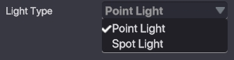
Light Type (dropdown)
Point Light emits light around the object in all directions.
Spot Light emits light in front of the object in a cone shape.
Starting State - Set the light be on or off at the start of the Experience.
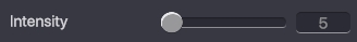
Intensity (slider: 1-100) - Determines the brightness of the light.
NOTE: This value is used to prioritize how different light sources will blend together.

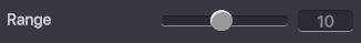
Range (slider) - Defines how far from the source the light will reach in blocks.
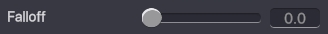
Falloff (slider) - Increase or decrease the gradient of intensity from the center of the light source.
A lower value creates a softer edge at the range set, while a larger number creates a harder edge.

Spot Angle (Spot Light - slider) - Set the angle for the cone shape of a spot light (relative to the center of the light cone).
 When you click on the colour box:
 Note: You MUST Click
 Apply so your settings will be saved.
Light Color - Select the colour of the light from a color picker or by inserting a Hex Code. The preview box (top left) updates as you adjust. Adjust by moving the crosshair in the selection square or dragging the arrows in each slider: RGB - Red, Green, and Blue primary colors HSV - Hue, Saturation, and Vibrance present Filter color options in the selection square: HS - Hue and Saturation
HV - Hue and Vibrance
SH - Saturation and Hue
SV - Saturation and Vibrance
VH - Vibrance and Hue
VS - Vibrance and Saturation
Hue
 Saturation
 Vibrance

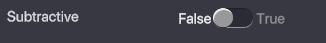
Subtractive - Remove light if True
 NOTE: When normal light and subtractive light overlap, they will blend depending on which light has the greatest Intensity value.
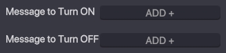
Message to Turn ON - Add the message(s) required to turn on the light. Message to Turn OFF - Add the message(s) required to turn off the light.
Position Offset (new in 0.11) - Offset the light from the actor the component is applied to. Note: This parameter improves Light use when applied as an Avatar's Feature.
Last updated
Was this helpful?